Dude, where's my bus?
Testing the accuracy of TFL's bus arrival time projections with traffic awareness
Testing the accuracy of TFL's bus arrival time projections with traffic awareness
In this post I'll investigate how we can use bus arrival time estimates to produce full distributions, add awareness of traffic levels, and use these to plan journeys more effectively.
As a Londoner, especially one who lives in the South East, five miles from the nearest tube stop, I spend a lot of my time on buses. This gives me a lot of time to think about buses and how they fit into modern multi-modal route planning technology. When travelling somewhere by public transport, I'll check my phone and be given a variety of options to choose from. Bus, train, rail, tube, ferry, boat, cable car(!), etc...
It gets interesting when there are multiple options, featuring connections. Here the quickest route isn't always the best route. Taking the fastest route could lock you in to a tight connection with no reasonable alternatives if you miss it. A slower route with more slack could be optimal for avoiding the worst case scenario.
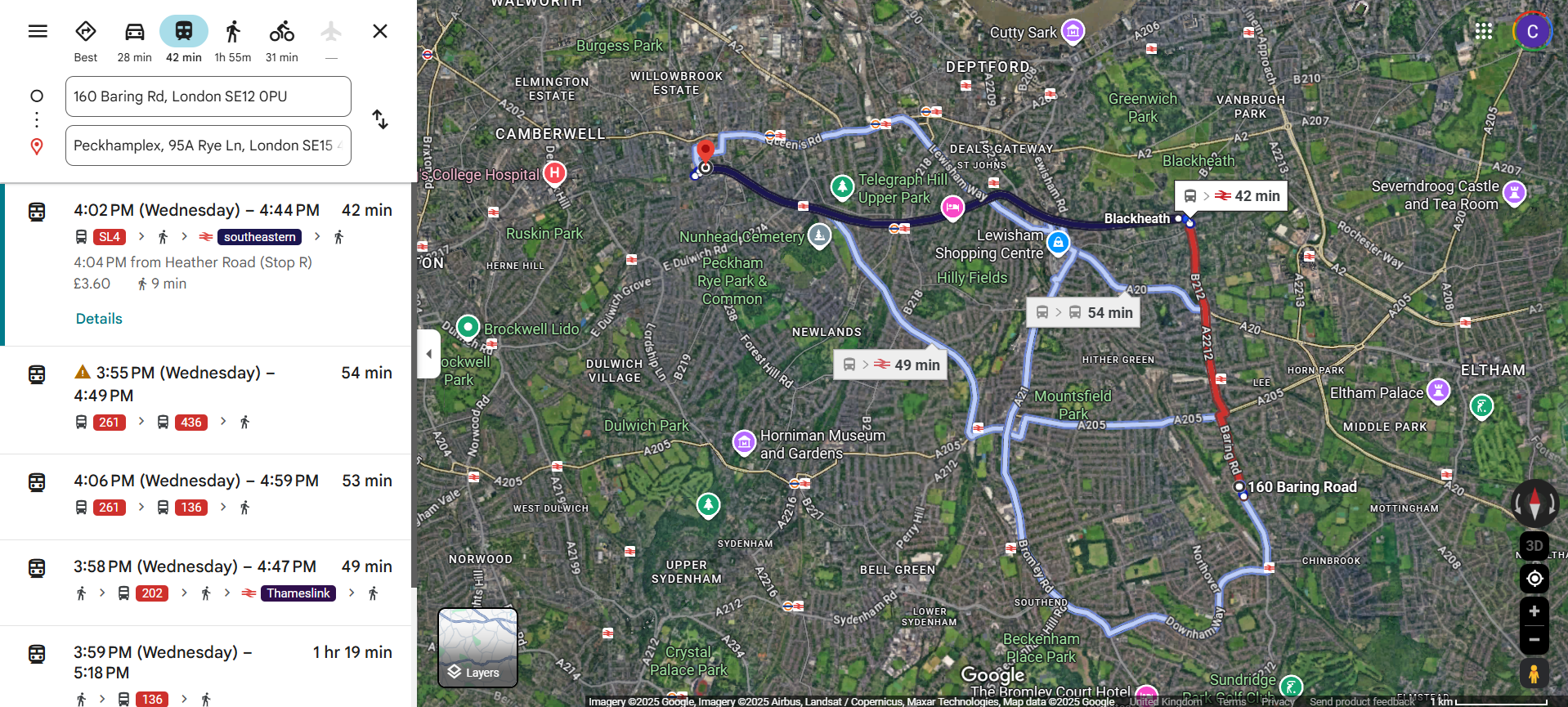
As an example, perhaps I finish work early and decide I want to catch a film in Peckham at 5pm. The fastest route is to get the SL4 bus into lovely Blackheath, followed by a train to Peckham. This option has a five minute connection between the bus and the train. In the heavy traffic between school pick ups and rush hour it is easy for the bus timetable to slip by more than five minutes. These trains only run once every 30 minutes, meaning that I'd be late for my movie with a five minute bus delay or more.
There is a slower route that involves travelling via Catford Bridge. This has a ten minute connection and the trains here are more regular. This means that there would be two more train options that would get me to my film on time, even if I missed the first one (which would be less likely anyway due to the longer connection window).
None of this would be obvious from the Google Maps screenshot below, where the shorter Blackheath route is clearly the favourite and the Catford Bridge option only shows up as the fourth one down.
I would love to have an option that gives me a range of arrival times and would suggest a route based on my specific risk tolerance while weighing up the full likelihood of journey outcomes. To do this we need to interrogate what lies beneath the route planning - bus arrival times.
Transport For London (TFL) provides locations and estimated arrival times for different modes of transport through their API which is open for the public to access. People have used this to create cool interactive boards with live tube locations.
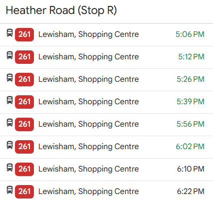
The image on the right shows a bus schedule on Google Maps for the 261 route at a single stop on the northbound route, with the green times being live estimates coming from buses that are currently en route.
These estimates come from information using the iBus system, which uses GPS to narrow down the bus location. Interestingly, iBus can be used to give buses preferential treatment at traffic lights. I'd never heard of this before but this feature probably isn't advertised widely as motorists don't need any more reasons to dislike buses! The bus position information is passed to a central system that uses the data to predict the bus arrival time at future stops.
There isn't much that I can find online about the method for making these predictions. A 12-year old academic article states "The information on the time at which buses pass each stop is stored in such a way as to enable TfL to convert the distance each bus is from its next stops to a likely arrival time in minutes. Travel time between stops clearly varies by time of day, day of the week and between school terms and holidays. By relating the current time to bus speeds and times during equivalent historical time spots, TfL's predictive modelling systems can provide a much more accurate estimate of likely arrival times, given the current location of each bus. All this is undertaken in real time."
Route planning applications will use these values as inputs, but let's have a look and see how robust they are.
For my test I've focused on the 261 bus route northbound. I saved off predicted arrival times for every bus on this route at minute intervals during waking hours from Monday to Friday. The data looks something like the below:
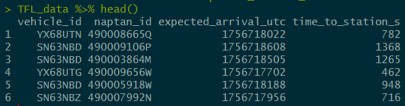
At each API call I took the vehicle ID, stop ID (naptan_id), the expected arrival time, and the time between now and the expected arrival time.
I couldn't find an easy way to get the actual arrival times of buses, so I used the point at which a specific vehicle + bus stop prediction left the dataset. When this was reached I labelled the arrival time as the last recorded estimate for that bus. Buses go round the route in a loop so the same vehicle will pass the same stop several times per day. Only matches that are close enough are recorded as arrivals.
By comparing the actual arrival time to the predicted arrival time, we can get the following distribution:
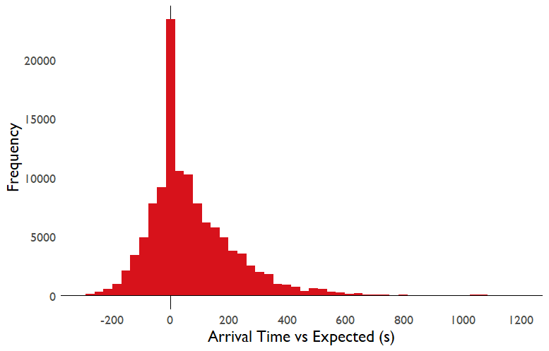
There is a strong peak at the predicted arrival time, more of the distribution lies to the right of 0 than the left, so buses are more likely to be late than early compared to their predicted arrival time. This makes sense, I would expect TfL to err on the side of predicting an arrival time that is too early relative to too late. You can always wait at the bus stop a while longer for a bus that is a little late, but missing a bus which left earlier than scheduled can be much more disruptive. I'm actually surprised at how much of the distribution is covered by buses leaving early but it does mean that the bus arrival times are decently calibrated.
I should note that this distribution shows the difference between a bus arrival time and its predicted arrival time while already on its route. Buses are almost never early relative to their scheduled times, and these arrival estimates from TfL will bake in any delays that have already occurred by the time the prediction is generated.
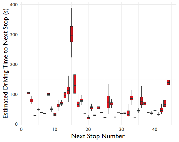
Some predictions will be easier than others. If a bus is close to its next stop then the prediction is likely to be accurate. If the bus is 20 minutes away then much more can change in the meantime. The boxplot below shows this effect.
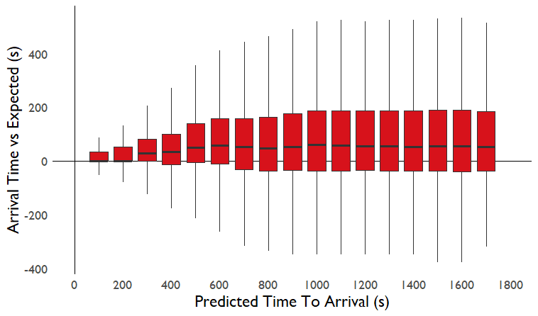
We can see that as the predictions get further into the future, the spread in error increases. Also, a small bias emerges where beyond 10 minutes into the future, the buses will on average arrive 80-90 seconds later than scheduled.
I could stop here, make some recalibration to the estimated bus arrival times and use the measured error bars to inform my journey planning, however I'm interested to understand what drives the variation in arrival times to see if I can make the predictions even more accurate.
An unfortunate necessity in London is that for most of their journey, buses have to share the road with cars. This means that bus punctuality suffers when traffic builds up, there's only so much space to add bus lanes to alleviate this problem. I believe that traffic is what causes some of the uncertainty in bus arrival time.
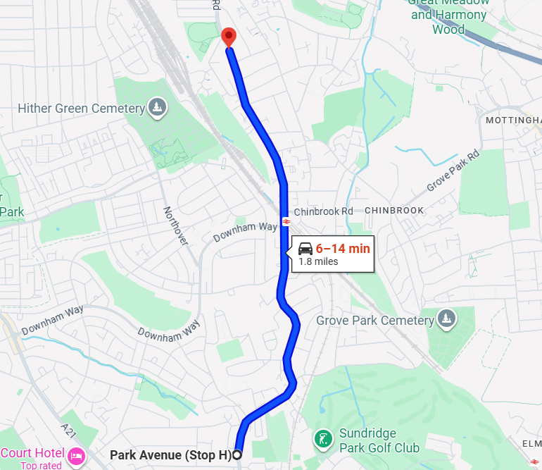
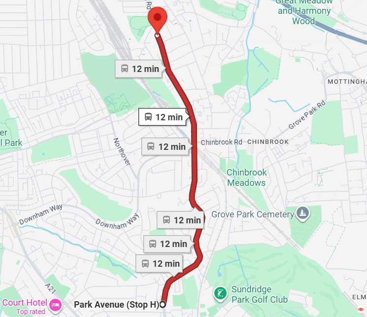
Consider the journey below. The car route is forecast to take anywhere from 6 to 14 minutes depending on traffic, meanwhile the bus forecast is a stable 12 minutes. There are 9 stops on this bus route, and no bus lanes, so a reasonable bus forecast would be driving time + 3-5 minutes.
To measure the amount of traffic on the bus route we can use Google's Routes API. One can choose a pair of latitudes and longitudes, and Google will give you the current travel time between those two points, including the impact of traffic. Every 15 minutes I collected live traffic information between every set of consecutive stops on the 261 bus route.
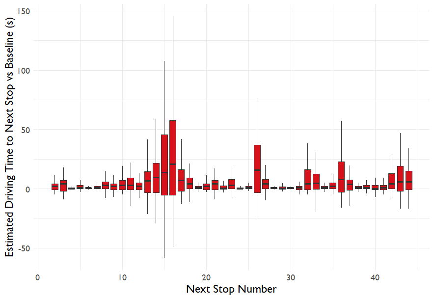
Here's how the travel time between each stop on the 261 route looks
Some driving times are very stable, others vary significantly. The outlier at stop 15 isn't actually measuring the route the bus would take, cars are sent a long way around a one way system but the buses take a direct bus-only shortcut, so this part of the journey isn't being properly measured.
Some of the bus stops are ridiculously close to one another, with driving times of only 15-20 seconds, in several cases one bus stop is visible from the previous one. See this article and this article for more discussion of London bus stop distances.
We can calculate a baseline driving time estimate between each pair of stops by taking the 30th percentile time from the full distribution. The variation vs the baseline is shown below.
Next we can see how the traffic time vs the baseline helps us to understand what drives inaccuracies in bus arrival times. Traffic and TfL data were collected separately so we can join on the traffic information to the data on expected arrival times by doing a fuzzy join and only taking the traffic estimate that was made closest to the bus arrival time collection (a maximum of 7-8 minutes apart).
The graph below shows how the traffic time above baseline relates to the error in the TfL arrival time prediction. A 1:1 line is shown in red. The blue line is the line of best fit to this data sample. We can see that the relationship is very noisy - you're unlikely to get a very good model on this real world data, especially when much of the predictive "juice" will have been squeezed by TfL's existing algorithm for predicting arrival times!
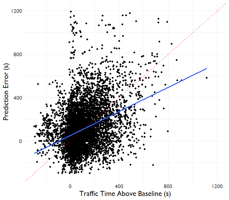
There is some degree to where we can improve the predictions with traffic time differences. For each minute of traffic time above baseline, we can expect the prediction error to increase by 31 seconds. This is understandably a weak relationship, the R^2 of a linear model to predict arrival time error from traffic above baseline is 0.13 (correlation coefficient of 0.37). The standard error in arrival time predictions reduces from 206s to 172s after using the additional traffic data.
If the distribution of arrival time prediction errors looked normal, then I could simply train a model for the average prediction error, followed by a model for the standard deviation, and this would give me the normal distribution of actual bus arrival times for a variety of scenarios. Unfortunately, as we saw above, this distribution looks clearly skewed and so we'll have to try something a bit different.
In my experience with data science, the majority of the time you only want to predict a point estimate of your target variable. In this case we need more than that, we need to predict the full realistic distribution of our target variable to understand the reasonable worst case scenarios for our bus arrival times.
There are many methods one can use to predict such a distribution. In some cases you want to have a fully parameterized shape, in others you may just want the best prediction of the Nth percentile outcome. In this case I'm going to do the latter, I do not need to know exactly how to parameterize the distribution of arrival time errors, and how those parameters vary with other variables. I only need to know the output shape of the distribution so I'll use something called quantile regression for this problem.
With regular regression, you get an estimate for the mean value of your target variable. With quantile regression, the objective function changes so that you can get an estimate for the Nth percentile outcome. For example if I want to predict the 10th percentile outcome, then the model will be optimized to produce outputs where 10% of the actual values are below the estimate and 90% of them are above the estimate.
Doing many quantile regressions at once gives you a sense of the spread in likely outcomes and can account for any weirdness in the distribution shape without needing it to be parameterized.
An alternative similar approach could be to use models to predict the likelihood of prediction error > Q for a sequence of Q values. This would effectively produce the cumulative distribution function as a function of the input variables. This method is a bit more sensitive to how you bin your function as you have to deal with potential non-monotonicity in the predictions.
For my quantile regression I used a linear model formula that had three separate input variables. Traffic time above baseline, expected arrival time above baseline, and the expected arrival time itself. Both of the first two variables were interacted with expected arrival time.
The results below show the 5th through 95th percentile quantile regression predictions for a variety of cases, representing times when the bus is close or far and when there is lots or little traffic. In the graphs below, a far bus is 15 minutes away from the chosen stop and a close bus is within 2 minutes. High traffic is at least 5 minutes above baseline and low traffic is the same as baseline.
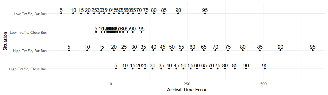
It's easier to visualise these as box and whisker plots when the numbers get bunched up close together.
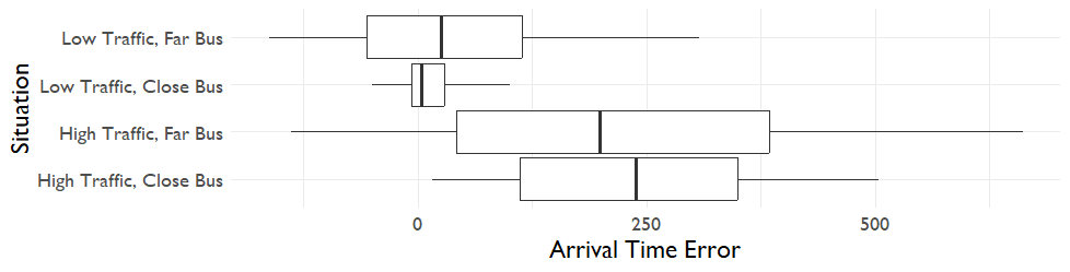
We can see that the model is appropriately capturing the greater uncertainty for buses further away or buses in high-traffic situations. The skew is being captured as well, we can see that the right whisker is longer than the left whisker.
The widget below lets you tune the traffic and bus expected arrival times to see how the distribution changes in different situations.
Traffic above baseline (s)
Arrival baseline time (s)
Time to station (s)
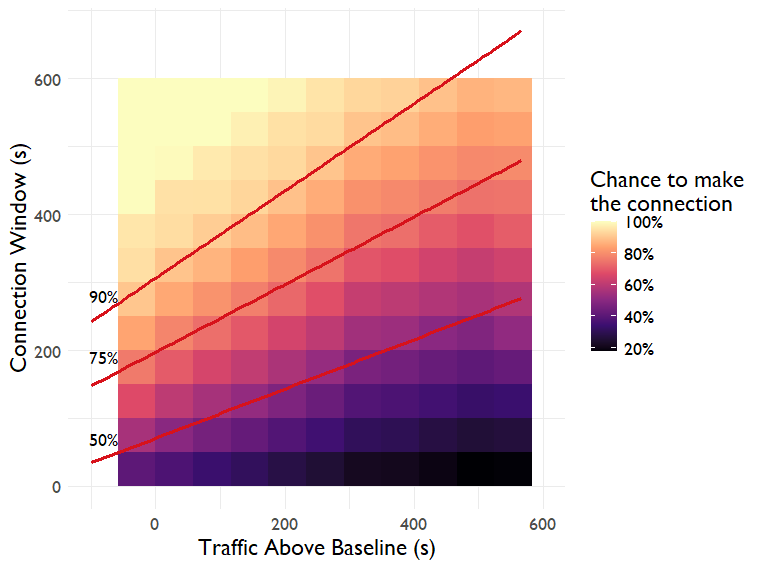
Let's use this model in a test case to understand how traffic affects our likelihood of making a specific connection and of expected travel time on a particular route. For this test case I'll use the trip to Peckham from the start of this post, aiming to arrive at the cinema before 5pm.
On this route there is a theoretically shorter route via Blackheath with a 5-minute connection to a train that runs every half hour. There is an alternative route via Catford that has a wider connection window and more regular trains. For this example, I'll assume all bus routes have the same dependence to traffic and arrival time as the 261 that I trained my model on.
With no traffic you'd be expected to make a 5-minute connection 90% of the time. In heavy traffic (+10 minutes) that connection would only be made half the time, even if TfL's journey length prediction was longer to compensate - something that would be very relevant for journey planning if that connection was important. The graph below shows how the chance of making a connection shifts with the traffic level. Contours of constant probability at 50%, 75% and 90% are shown as well.
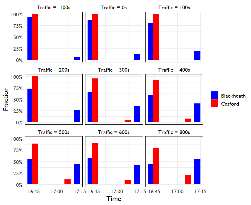
How does this affect our arrival time distribution? The distribution of arrival times is shown as a function of traffic below. We can see that the Catford route is much more robust to traffic than the Blackheath route. The Blackheath route (blue) arrives earlier on average than the Catford route (red) for traffic <= 600s, but the downside risk of the much later arrival time when missing that first train is larger for the Blackheath route.
Thanks to the generosity of TfL's open data (and Google's free API trial) I've been able to thoroughly investigate the distributions of bus arrival times, along with their sensitivity to traffic along the route. It's possible to make slight improvements to TfL's arrival predictions with the integration of traffic information, however these are unlikely to be substantial enough to justify the cost of regularly querying traffic information.
This data has been used to produce realistic arrival time distributions which are more useful for journey planning than a point estimate. We've seen an example of how a slower route can be much more robust to bus lateness than a faster route. If I was more of a software engineer, I'd be working on a way to scale this and give myself route recommendations that can account for the level of risk in a particular choice. Perhaps in the future I'll design a small interactive example of how this could work for limited routes.